UPDATED PICTURE COMING SOON |
Girl Scout
|
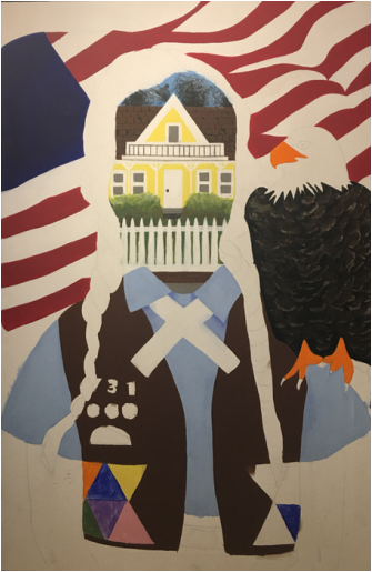
InspirationAmerican PropagandaAmerican propaganda during WWI and WWII displayed the happy women during those time who were eager to care for their husbands when they came home, and to clean the house while the kids were away. These propaganda pieces displayed "The American Dream" which consisted of a happy and healthy family, living in a small community with friendly neighbors, and enough money to live steadily with no worries.
On the art side of things, these propaganda pieces consisted of primary colors in order to portray a simple message without distracting the viewer. The use of red and blue were predominately used due to the colors within the American flag as well in order to display the pride of true Americans. PhotoshopIn Photoshop, I used many images to come up with a type of collage that I would eventually paint. I worked on Photoshop first in order to create my image as well as to plan out the image that I was attempting to eventually create. I thought about leaving the photo as it was (in digital form), however due to the age of the photos that I was using, the images were pixelated and not precise.
MeaningAlthough there are obvious elements within the painting, I'd like to explain one big aspect that may not be interpreted in the same way by everyone. This piece is throughoutly connected with my first studio piece this year and contrasts as that one was mainly to portray tragedy and depression and this one evokes a good life, and 'light'. The overall meaning of the piece goes to show the way that Jewish propaganda during the holocaust contrasted with the American dream and their propaganda of a wealthy, vibrant, happy life.
|
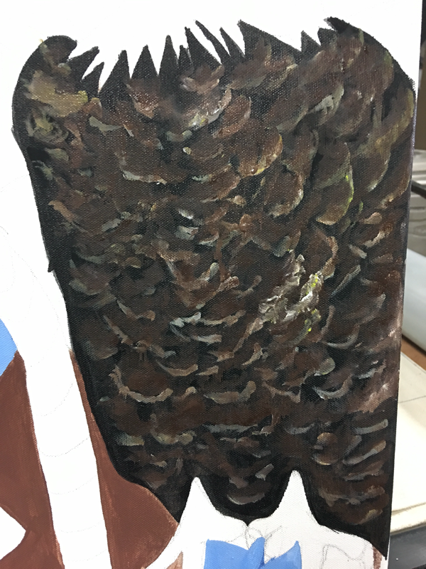
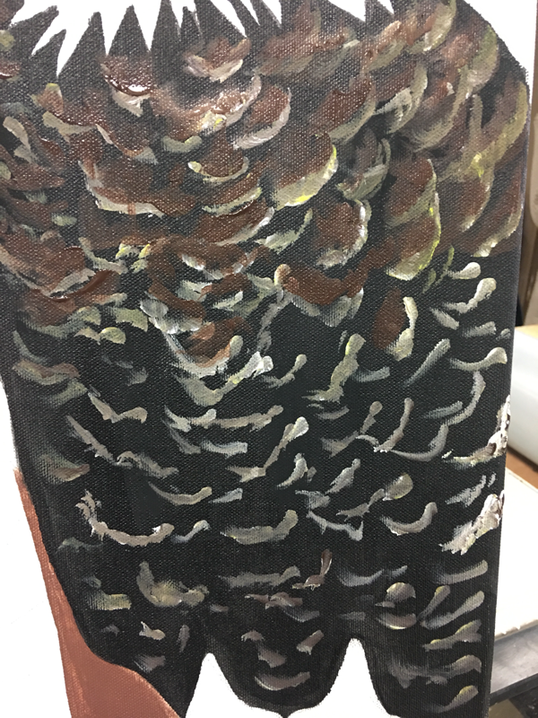
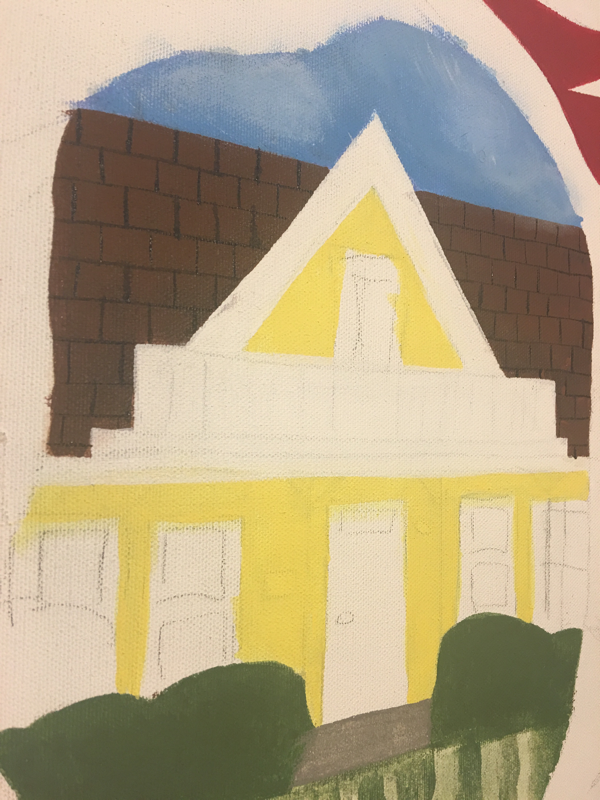
ProcessWhen creating the hawk, I struggled a bit with the hair on the chest area as well as the lighter parts on the face of the hawk Therefore I began to experiment using small brush stroke that could be recognized in the impressionist movement. I went through this process for the grass on the landscape within the face as well. Another way that I used experimentation was in the shirt bushes by the house as I used the impressionist movement once again to create strokes that would evoke highlight and give dimension to a regular bush.
As I began to create, I noticed that I went for solid colors first and one of the biggest solid things that caught my attention was the Nazi flag, so I painted that first. After I painted the red in the flag, I moved onto the braids which I was hesitant about at first. I didn't want to lose the shape/outline of the braids and throw them out of wack which would make them look distorted. I eventually got over my nerves and painted them solid brown which gave me a sort of guideline when I would eventually add value. A large part of the piece was the shirt of the girl which at first I couldn't figure out how to tackle. After sitting for a few minutes just thinking, I started to just start painting and see what happened. Eventually I figured out that I'd do a watercolor effect for the top part and a solid black part for the bottom portion. I was debating whether or not I was going to add wrinkles to the black part of her shirt or not just to dimension. I eventually finished her shirt and began to work on the highlight in her hair, but I only painted half of the highlight on her hair simply to experiment and I enjoyed the way that the highlight gave her hair a lot more dimension. I soon finished that half of her head but I was not sure if I needed to do more, so I began working on the monkey behind her shoulder. While painting the monkey, I kept the hair in the back of my head so I could think/debate on what I'd do (whether it be adding more tones so the hair isn't so flat, or even adding a shadow). ConclusionAs I created the piece, I fell in love with it the more I painted. I went into this piece with a positive mindset which made my overall work ethic better when I created it. I spent a lot of time working on this piece, in order to incorporate some details. However a change that I would make would be to make the background a different color (other than black). There are already a lot of dark tones throughout the piece and the black background makes the monkey nearly disappear in the piece. Other than that, I am very satisfied with the outcome of this piece and I am excited to create the next piece in the series.
|